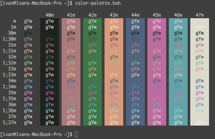
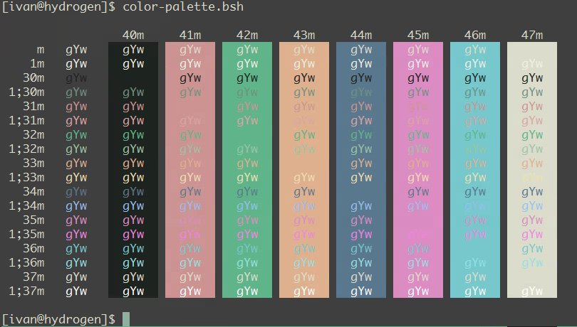
With my current job I started to spend even more time in terminal than before, however. It hadn’t taken long for my eyes to rebel refusing to carry the burden of the bright background stress. I had to seek the alternative. The black as a background colour doesn’t really work for me: it’s cold and repelling, not the kind of feeling you want to experience while working. Instead, it makes sense to have a colour palette that makes you comfortable, even cozy, a bit warmish, and still calm.
One of the first options I explored was Solarized – a much-hyped palette claimed to be designed with science underpinning (although I haven’t found any detailed description of that science). The problem with that palette is that it was designed for text editors, not terminals. I couldn’t come to terms with the fact that bright yellow, green, blue, and cyan were nowhere close to these colours.
I revelled when I discovered Zenburn – that very close to what I found comfortable with. There were still few issues with it: green, yellow, magenta, and cyan were too bright, black wasn’t really black but rather a light grey, while red and blue where too dark.
After few hours of tweaking colours I’ve got the palette so comfortable to me that I’ve been using it without a change for last 4 years.


You might be surprised, but at the moment I don’t use iTerm2, so I don’t have a scheme for it. Mostly this is because my work environment is Windows with PuTTY. And for the remaining uses, default Terminal.app is completely adequate.
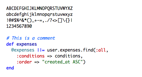
The font that works best for me is Monaco:
