Hofstadter's Law
It always takes longer than you expect, even when you take into account Hofstadter’s Law.
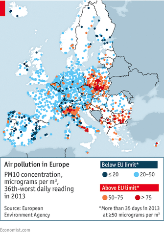
Air quality in Europe
Surprisingly, Poland has the worst air quality in Europe. Here is an infographics from the Economist:
See also Air Quality Indexes website.
Media Ideological Placement
Interesting information on ideological placement of various news outlets by Washington Post:

Catch22 of closed-mindedness
For the Nth time have found myself referring back to an exceptionally vivid infographics on how many Ukrainians have ever been abroad:

There are three parts of the country represented in the picture — the West, Center, and South-East. The colour code is as follows:
- The purple area represents percentage of people who have never been outside Ukraine
- The green area corresponds to those who visit other countries less that once per two years
- The blue — once every two years
- The white — once a year
- and the red for those who go abroad more than once a year.
It was a staggering revelation for me that almost 8 people out of every 10 have never been abroad in their life! Even more, another poll reveals that 37% of people never travelled outside their region (county) within Ukraine!
That data correlates neatly with the hostility or indifference towards the EU integration as well. In the west we see about 11% of people are regularly travelling abroad and support there for EU integration is the strongest. Compare this with a meagre 5-6% in the East with the most vocal opposition towards Europe. Indeed, the less people know the easier it is to manipulate them.
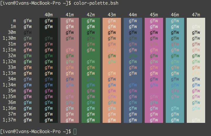
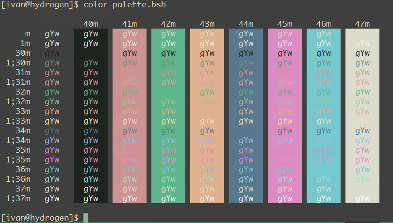
My zenburn-based terminal colour palletes
I was a big fan of standard linux terminal colour palette. Initially, the default was a saturated version and later it shifted to pastel colours. I still enjoy the way it looks – bright and clear; it also works great if you are giving a demo over a beamer, opposed to dark backgrounds.
With my current job I started to spend even more time in terminal than before, however. It hadn’t taken long for my eyes to rebel refusing to carry the burden of the bright background stress. I had to seek the alternative. The black as a background colour doesn’t really work for me: it’s cold and repelling, not the kind of feeling you want to experience while working. Instead, it makes sense to have a colour palette that makes you comfortable, even cozy, a bit warmish, and still calm.
One of the first options I explored was Solarized – a much-hyped palette claimed to be designed with science underpinning (although I haven’t found any detailed description of that science). The problem with that palette is that it was designed for text editors, not terminals. I couldn’t come to terms with the fact that bright yellow, green, blue, and cyan were nowhere close to these colours.
I revelled when I discovered Zenburn – that very close to what I found comfortable with. There were still few issues with it: green, yellow, magenta, and cyan were too bright, black wasn’t really black but rather a light grey, while red and blue where too dark.
After few hours of tweaking colours I’ve got the palette so comfortable to me that I’ve been using it without a change for last 4 years.
MacOS X Terminal:

PuTTY:

You might be surprised, but at the moment I don’t use iTerm2, so I don’t have a scheme for it. Mostly this is because my work environment is Windows with PuTTY. And for the remaining uses, default Terminal.app is completely adequate.
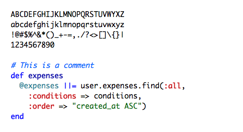
The font that works best for me is Monaco:

